I never thought I’d be that person to write rants on my site, but Outlook for iOS may be the exception that proves the rule. Allow me just two brief examples for today – and the first may help my Georgia College colleagues who are trying to report phishing attempts.
The user interface for Outlook for iOS isn’t quite as intuitive as it could be. And key functionality shifts location between the desktop, the web client, and the iOS app. My current institution likes to test its users frequently to see if we can identify phishing attempts. As a part of the services we receive from KnowBe4, we have an Outlook plugin called Phish Alert. On the desktop, it’s easy to find. On the web client, it’s somewhat easy to find. On the iOS/iPad OS client, it’s under the “3 dots” menu. But WHICH three dots menu? There are two. There’s one in a menu bar at the top of Outlook, and there’s another much smaller one by the actual message itself:
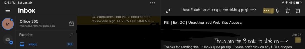
One of our IT guys and I traded about 10 emails back and forth before we recognized which menu held the magic plugin. GC people – click on the 3 dots menu on the actual message itself. Then you’ll see the phishing alert icon that you can then use to send phishing emails to.
One of other problems with Outlook for iOS/iPadOS is that it’s impossible to set a category for a message. Basically, to set aside a message, one has to pin a message, flag a message, or even pin and flag a message. I want special views. I want to see all my emails for a given category. I want to move an email to a category. I hope that this will happen sooner than later.