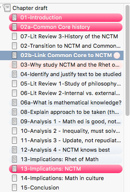
This was one of those ideas I had seen somewhere in Gwen Hernandez’s Scrivener for Dummies (I’m not ashamed to say I have that book; it’s a nice starting point for learning Scrivener.). But I’ve tweaked it in ways that help me know where I am when it comes to writing and using research.
In the document view, the part we’re going to tweak is the general status bar.
I’ve edited and added the fields as follows under Meta-Data settings:
I changed labels to Writing Status. This tells me how I’m doing on each portion of the manuscript.
- Concept: Needs development – I have some ideas, but nothing really formal yet.
- Writing begun. It’s in red to remind me I need to get going…
- Writing needs review. I’ve finished a draft, and now it’s time to edit.
- Ready for compilation. Yeah! This section is done.
What’s nice about this setup is that when you select View–Use Label color in (or in this case, View–Use Writing Status color in), there are several options available. Selecting “binder” gives a nice visual reminder of exactly where you are in different parts of the document.

(In this screenshot, the dark red indicates my progress in those sections of the chapter, while the light pink indicates that’s a section that I need to make final edits before it’s considered “done.”) I have mixed feelings about this, because it’s not completely accessible for people with vision concerns.
I also renamed Status as Source Status. This helps me remember if I’ve actually used my notes or quotations. I have several options that I’m using:
- Add more text
- Incorporated into paper
- Notes to move into research (I use this in the notes portion of Scrivener, since I have research as a separate part of the outline)
- Additional quotations: I’m not sure if they’re usable, but I found them anyway.
Now if only I could change the colors under my research folder in the same way that I could change the sections of the chapter, that would be an awesome feature addition.