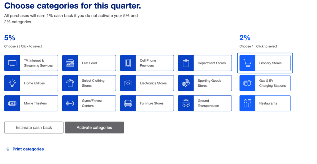
Today’s winner/loser is US Bank.
We have one of those credit cards that allow us to change the cash back that we receive on various categories.

Let’s talk about why this screen is so bad.
- For one thing, the shades of blue aren’t very different from each other. So it’s too easy to see them as the same color. I thought they were the same at first (and to be truthful, the second, third and fourth time around).
- If I were colorblind, I wouldn’t be able to tell the difference between the blues either.
- Finally, let’s look at this from a usability perspective. There are 12 choices for 5% options, and 3 choices for 2% options. That’s wasn’t completely clear to me at first, and only became clear when I the activate categories button didn’t work. At least the activate categories button does change color when the three categories are successfully entered, but color shouldn’t be the only way that we have available to figure out whether we’ve accomplished the task.
What would have been better?
- A two-step process. Choose the 5% categories first, and then choose the 2%.
- Better distinguished colors. I know US Bank is all about the blues, but perhaps a different color palette for the second type, such as yellow, would make it easier to see the distinctions between the groups.
I’ll admit that I haven’t yet run this page through a screenreader to see if there are any other problems. But I’m not very hopeful as to what I’d hear.